The Unlimted Edition
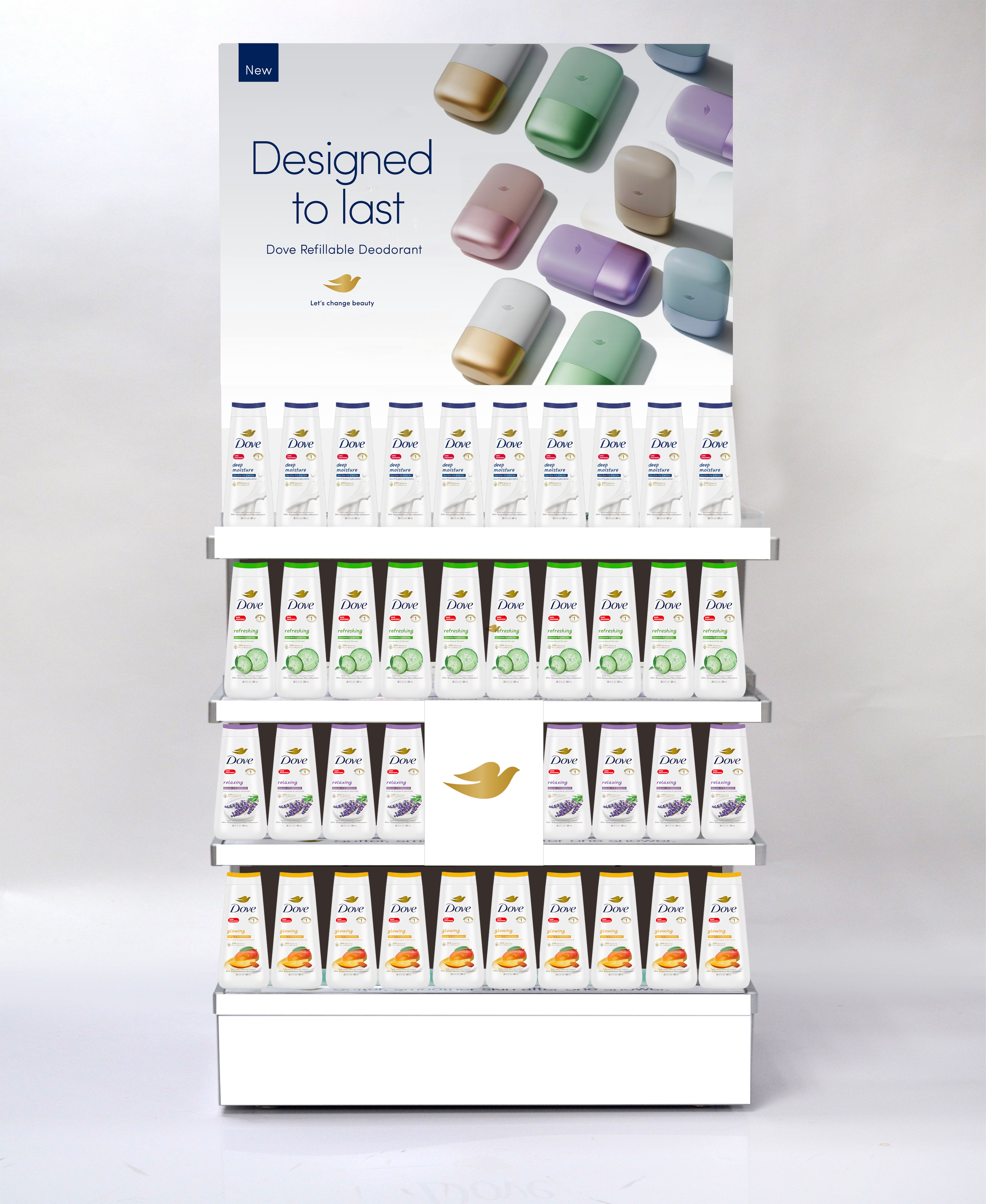
Role: Lead Designer/Art Direction I was heavily involved throughout the campaign, from the initial client-facing HotHouse workshop through to the development of the wider creative rollout. Building on the established creative direction, I led the design development across key touch-points, with a particular focus on OOH and product-led POS, translating the campaign idea of "Unlimited" into a cohesive visual repetition system that remained true to Dove's brand identity while scaling seamlessly across multiple platforms.
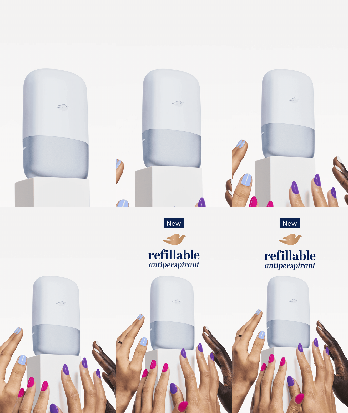
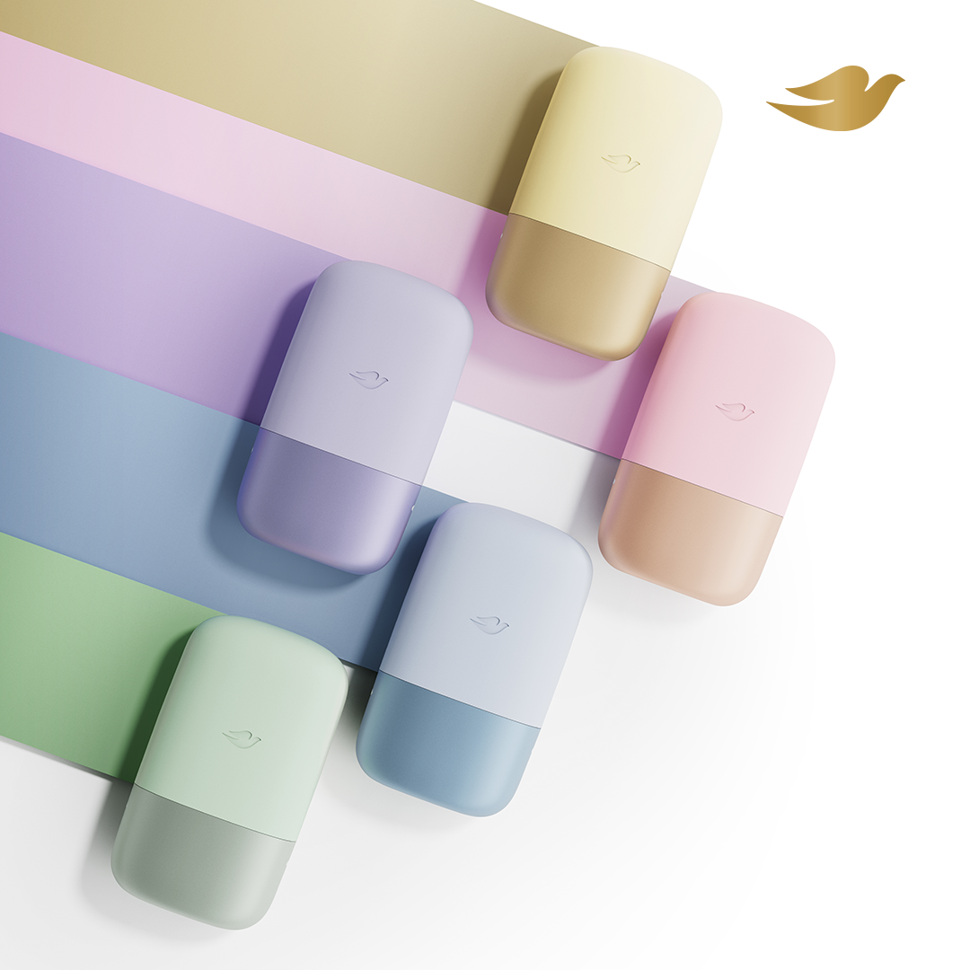
This was the product launch of Dove’s first refillable 72hr Antiperspirant.
OOH | Social | Print | TVC | POS | Motion
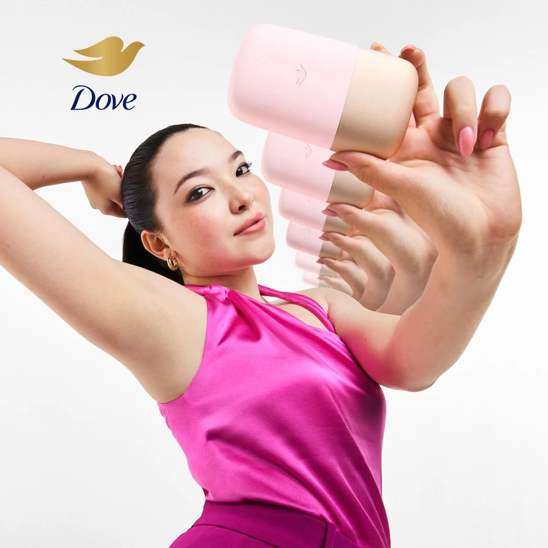
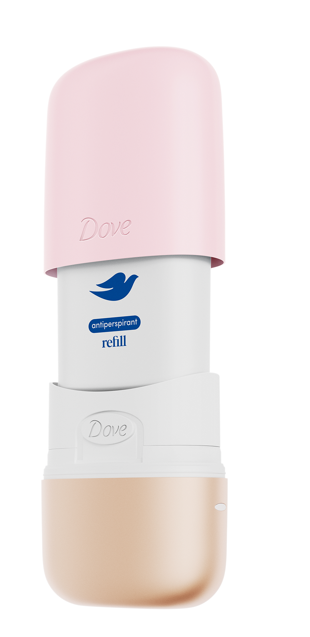
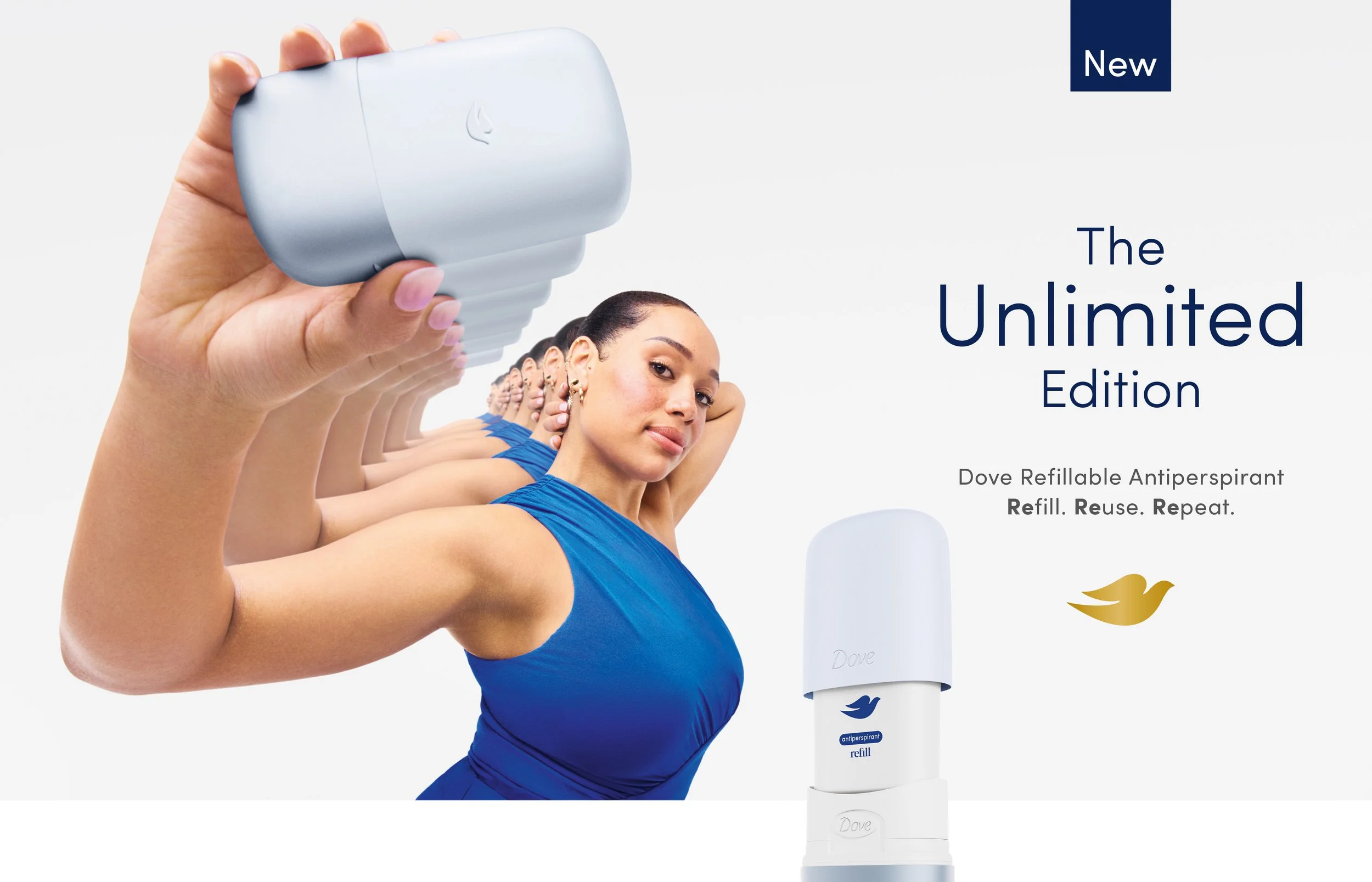

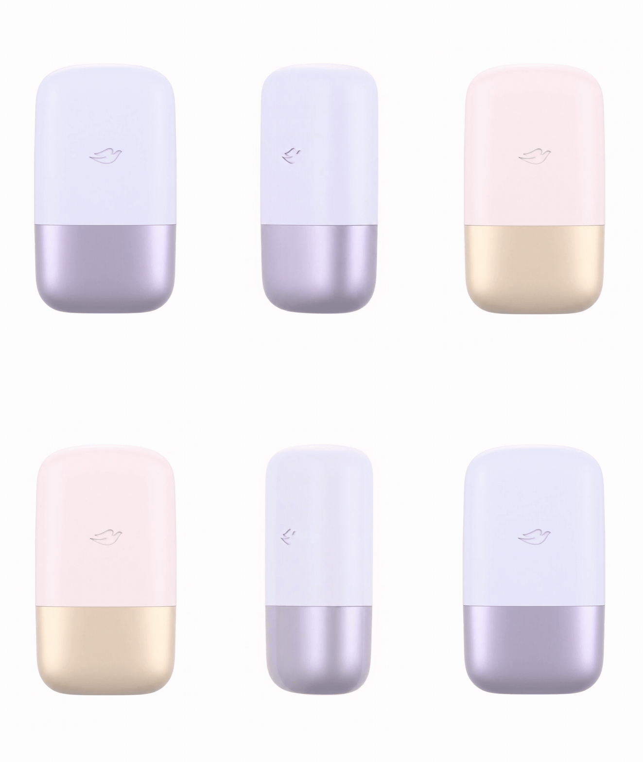
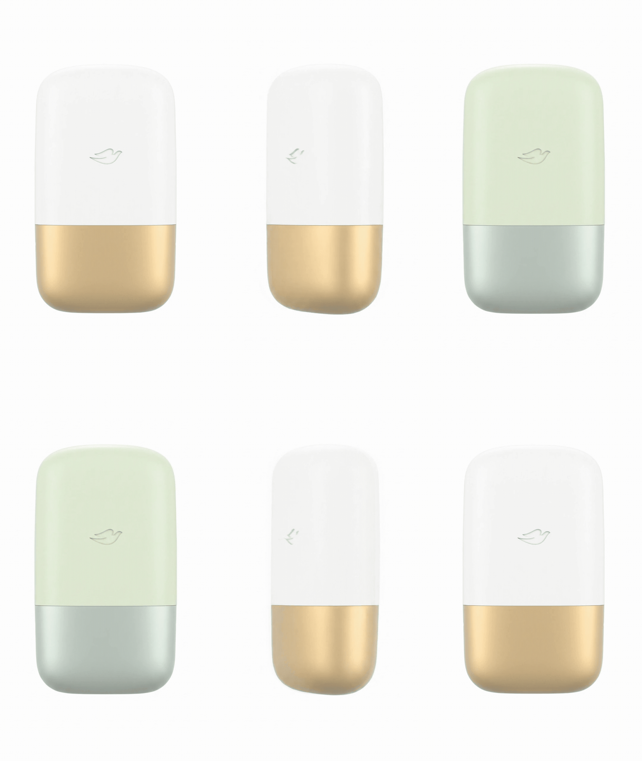
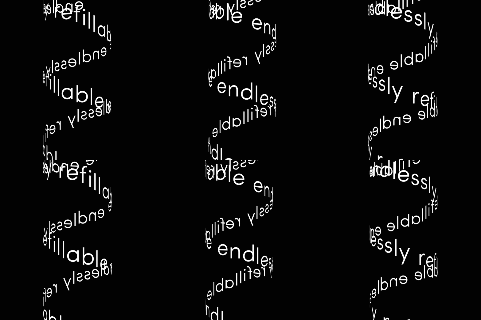
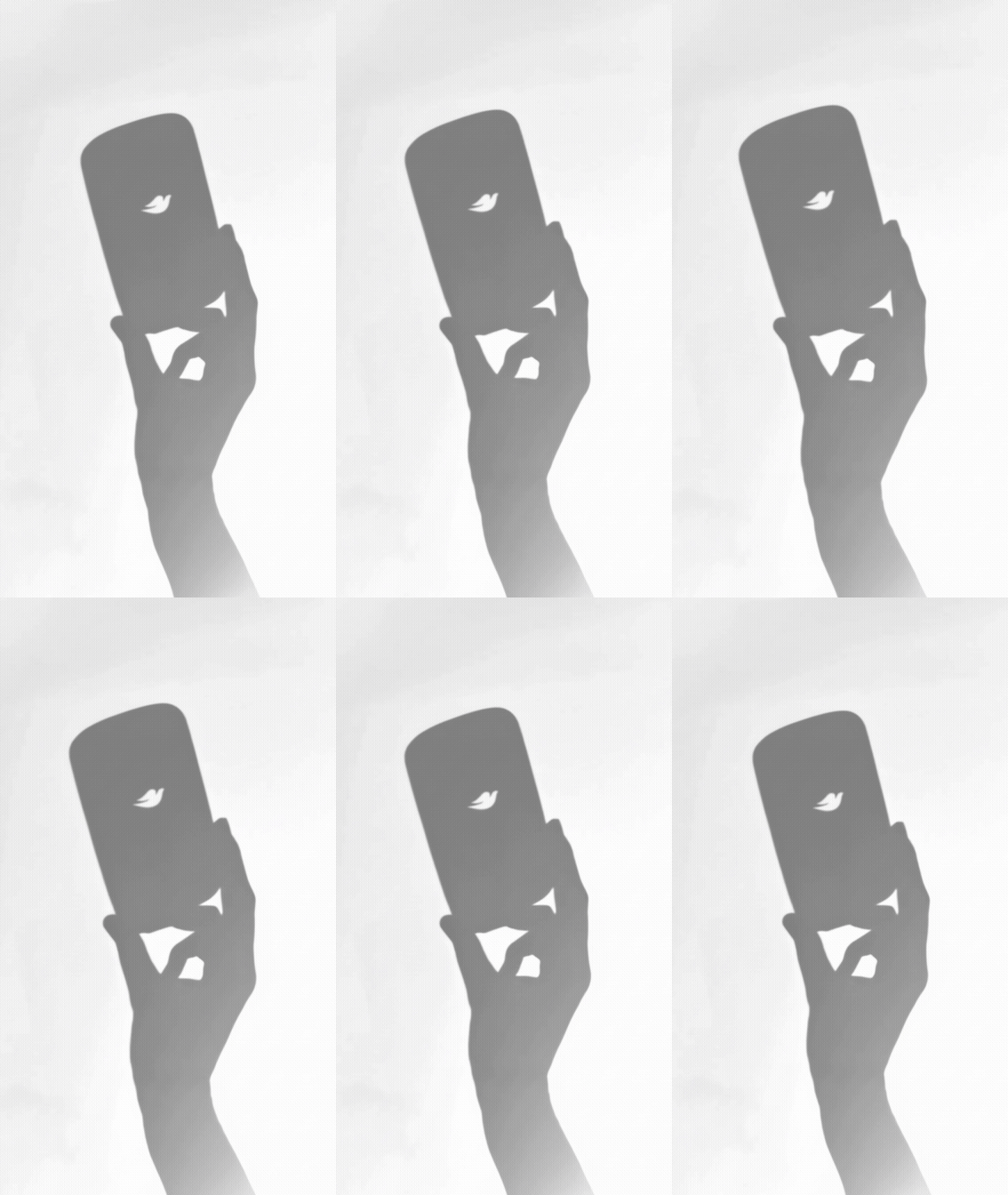
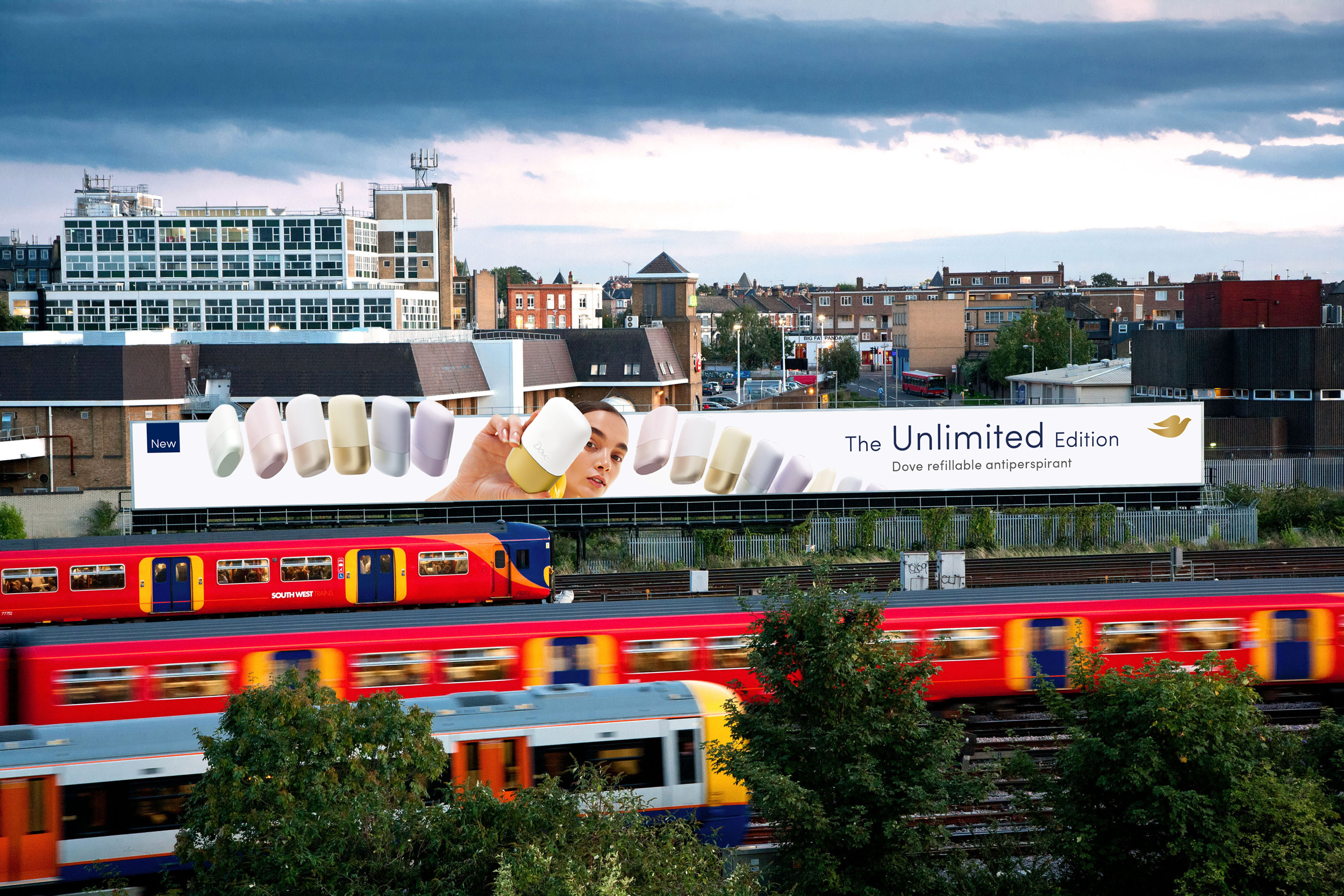
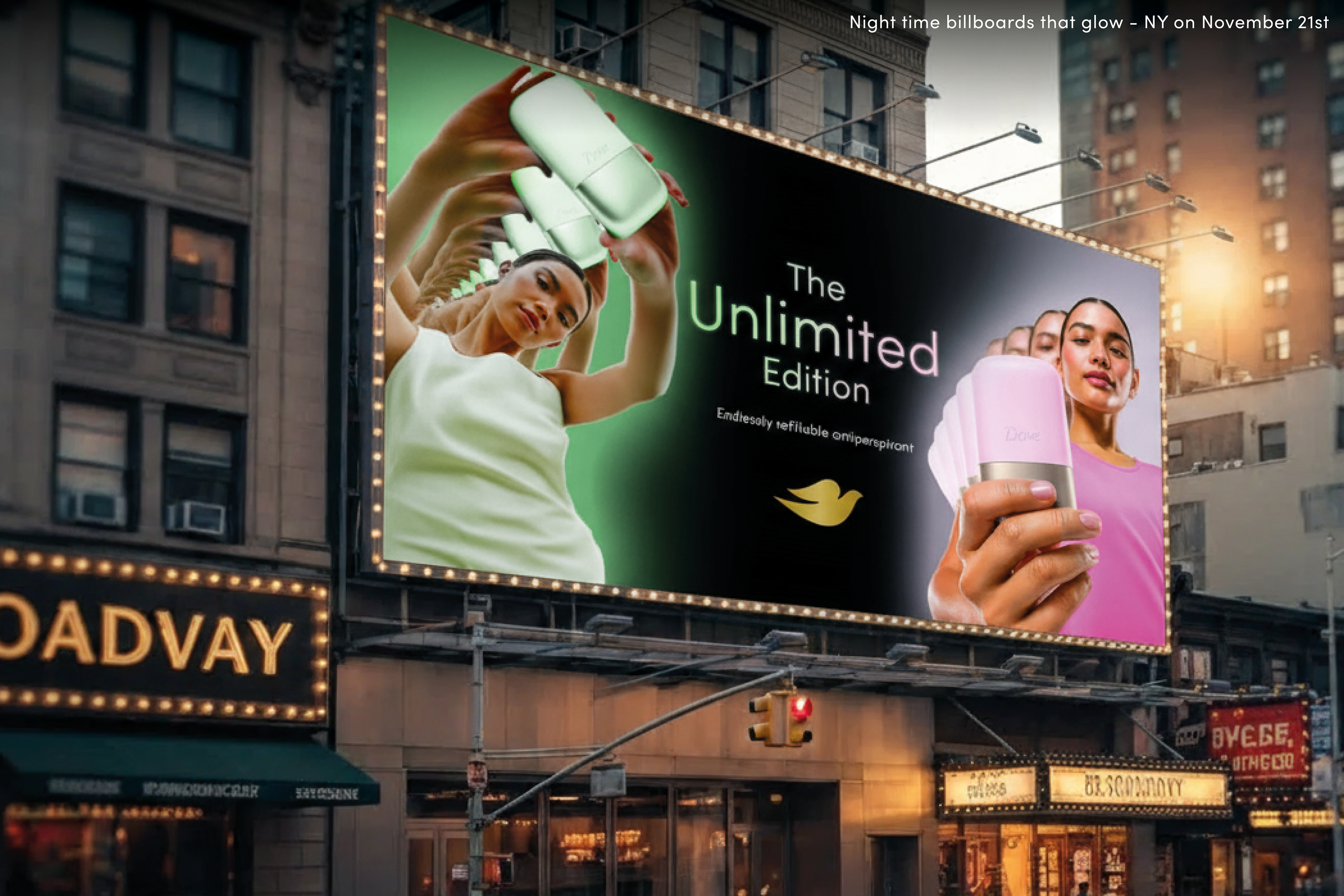
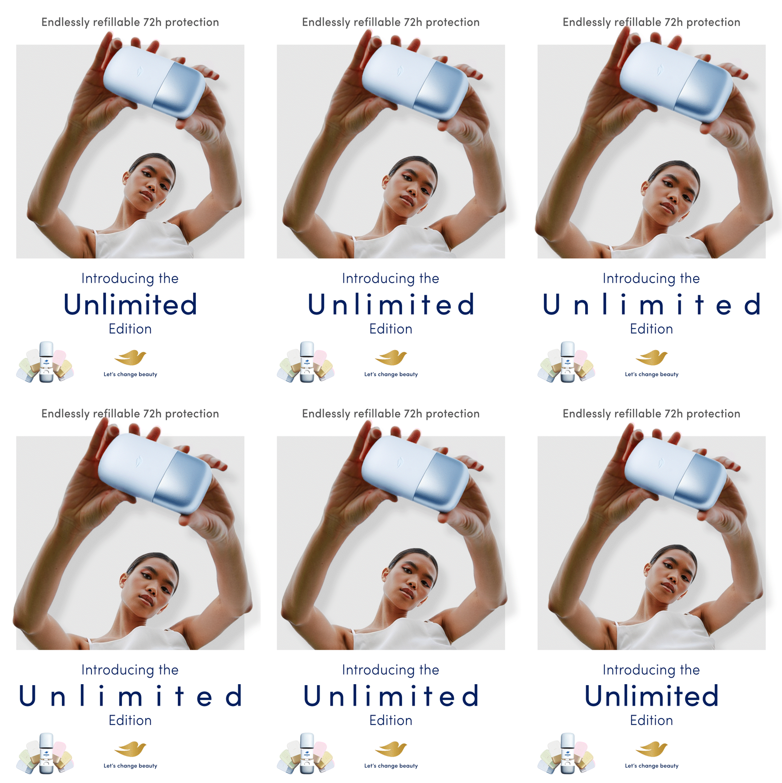
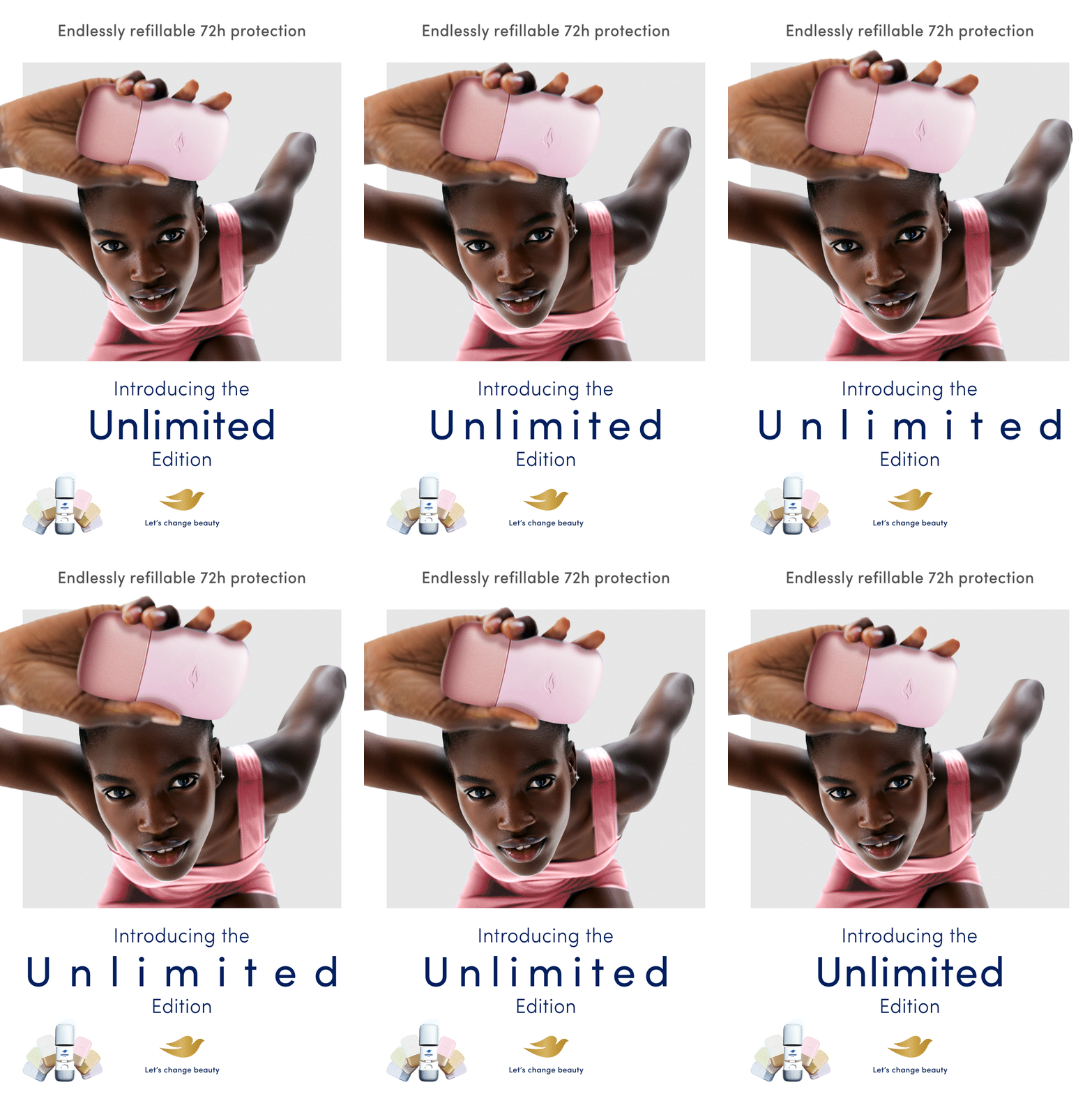
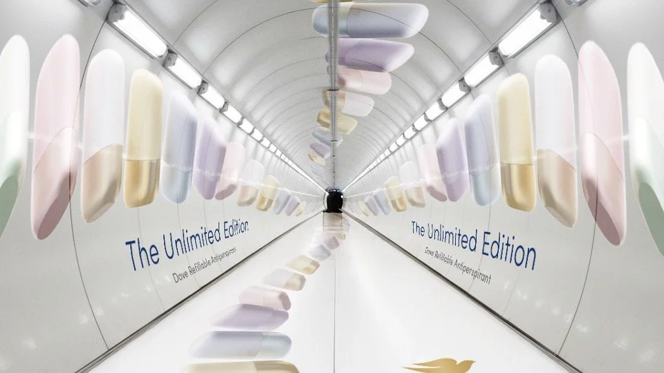
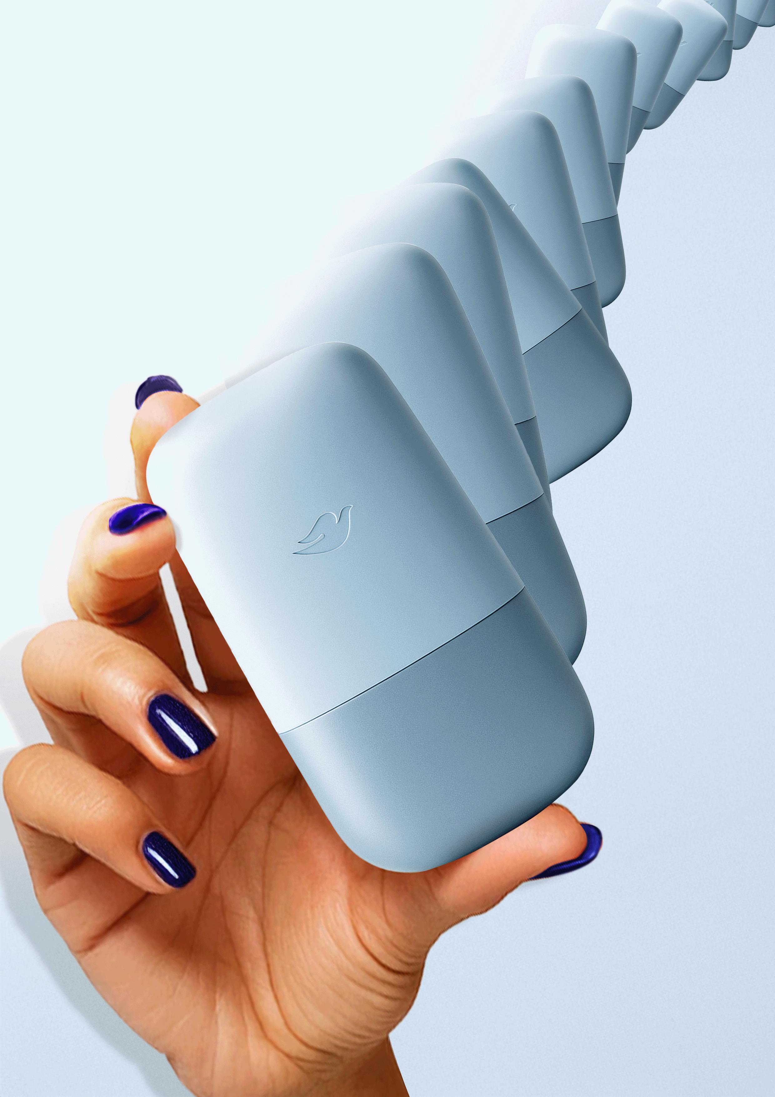
‘Unlimted’ OOH concept
- breaking the grid
As a brand designer, I’m always drawn to executions that strike this balance - breaking visually out of the standard grid. Its conceptual purity and visual disruption executed in as a literal endless wave of Dove product metaphor.
Simple, contextually aware. Impossible to ignore.
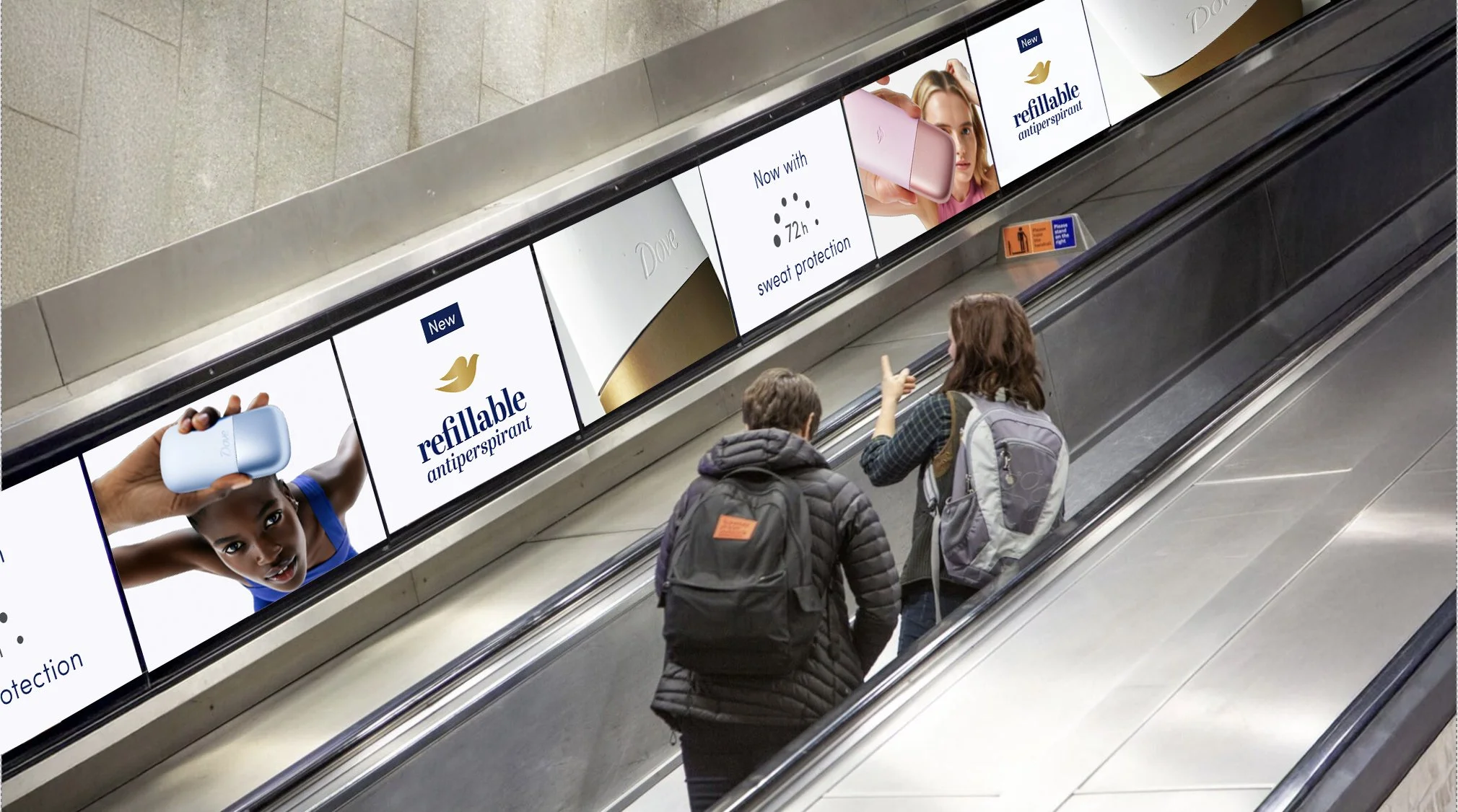
‘Unlimted’
escalator takeover
Another idea was to have an endless run of adverts along the escalators down to the underground - these would play the talent in their pattern formation, on repeat - a metaphor for the ‘unlimited’ run of products
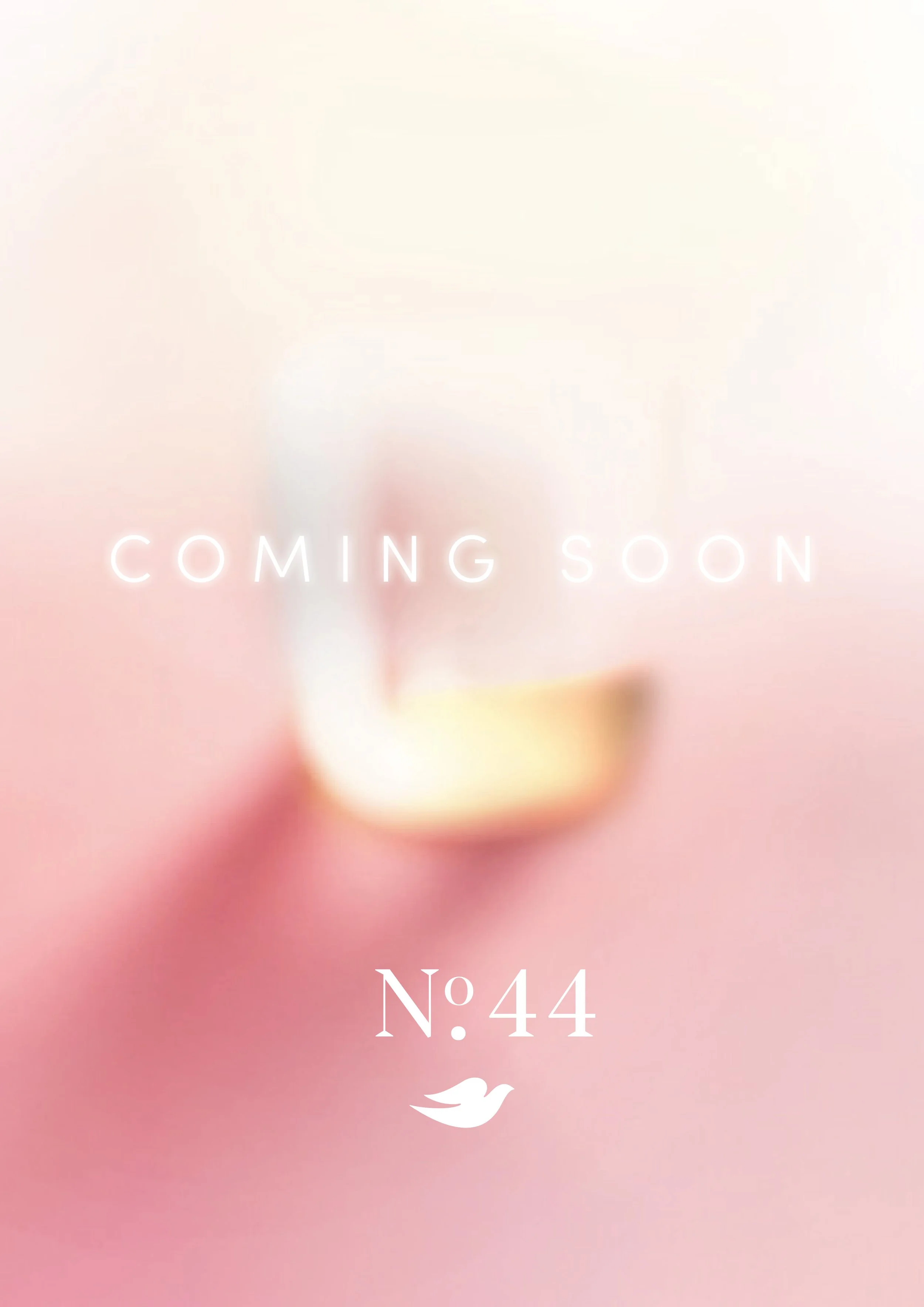
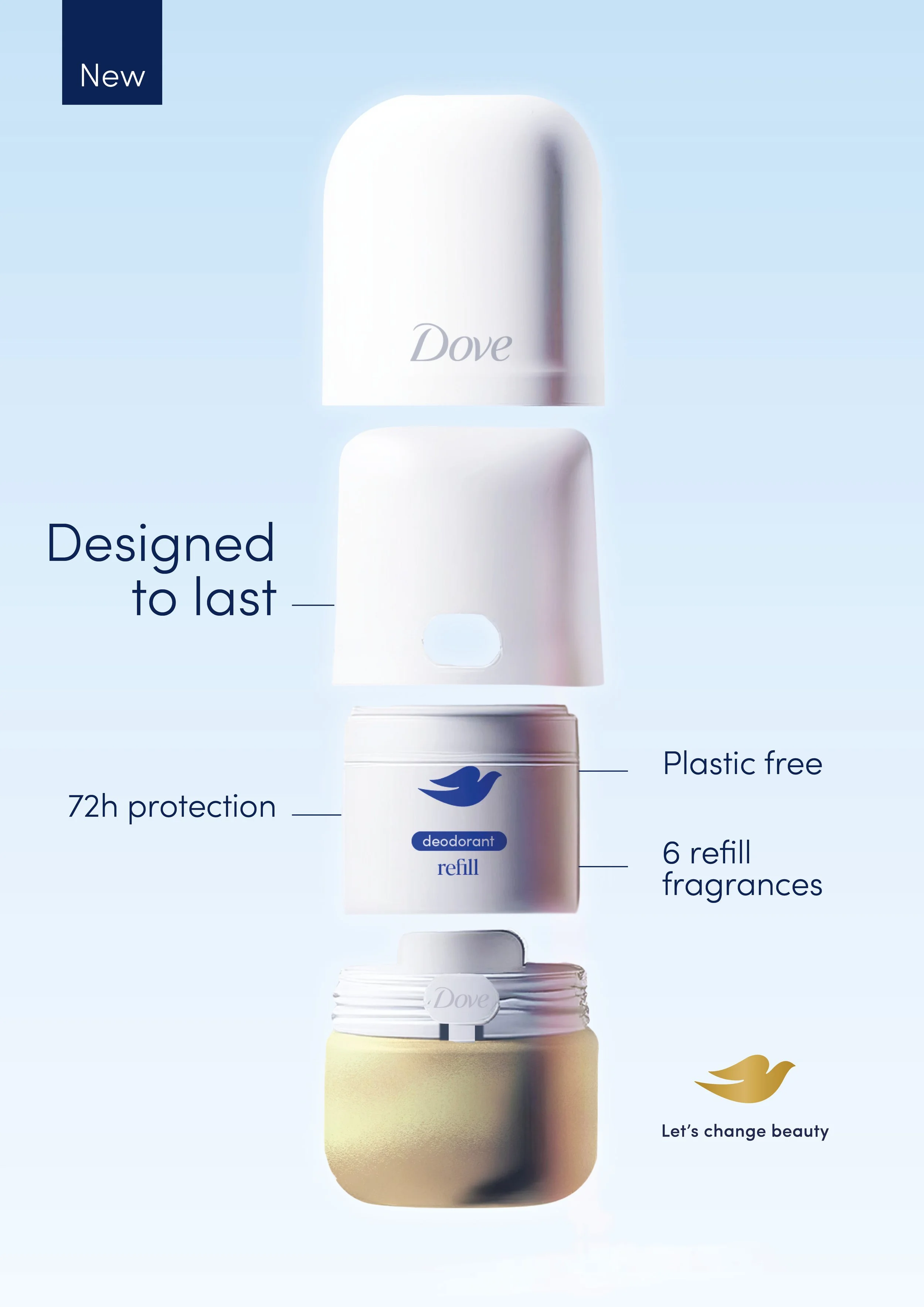
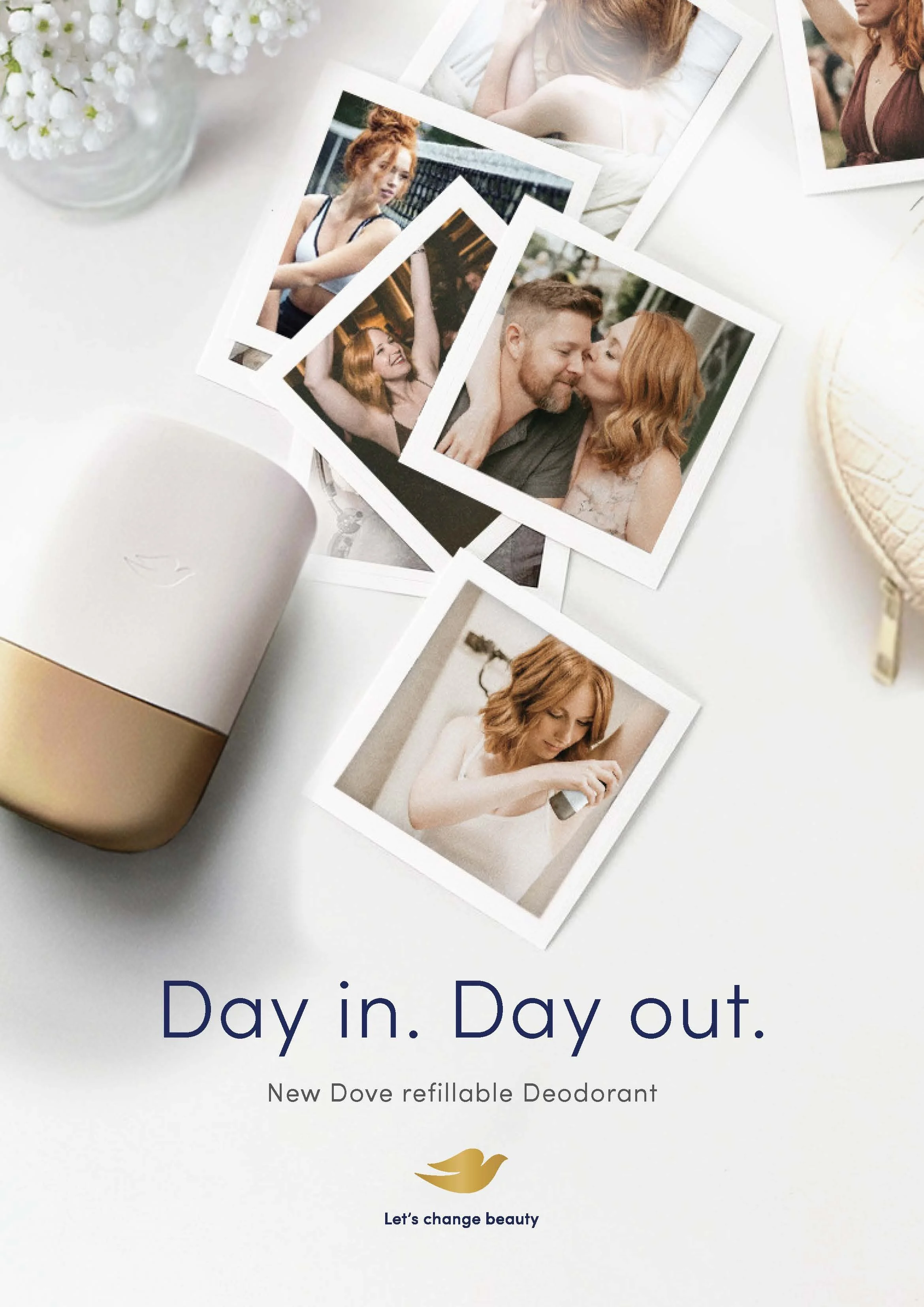
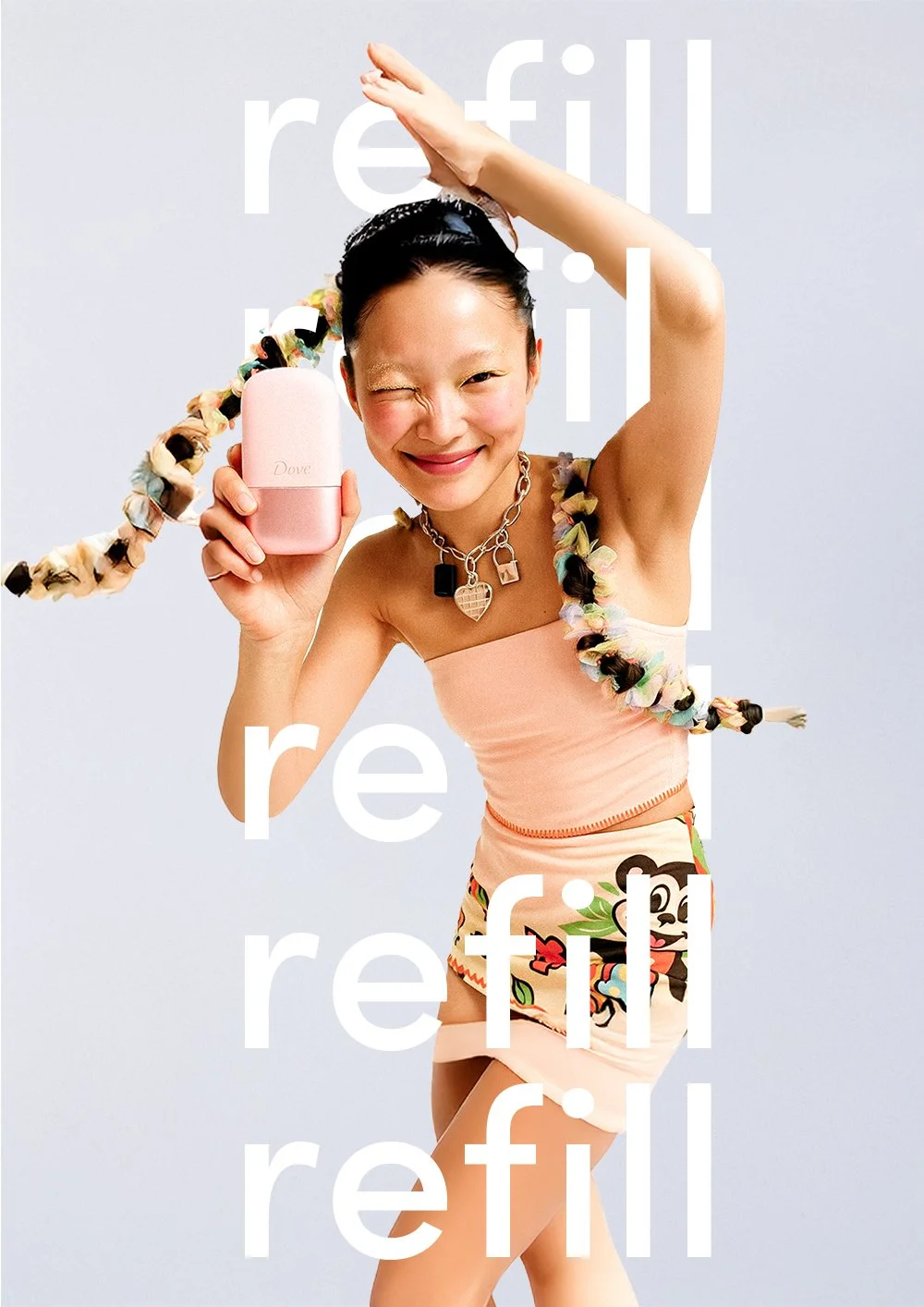
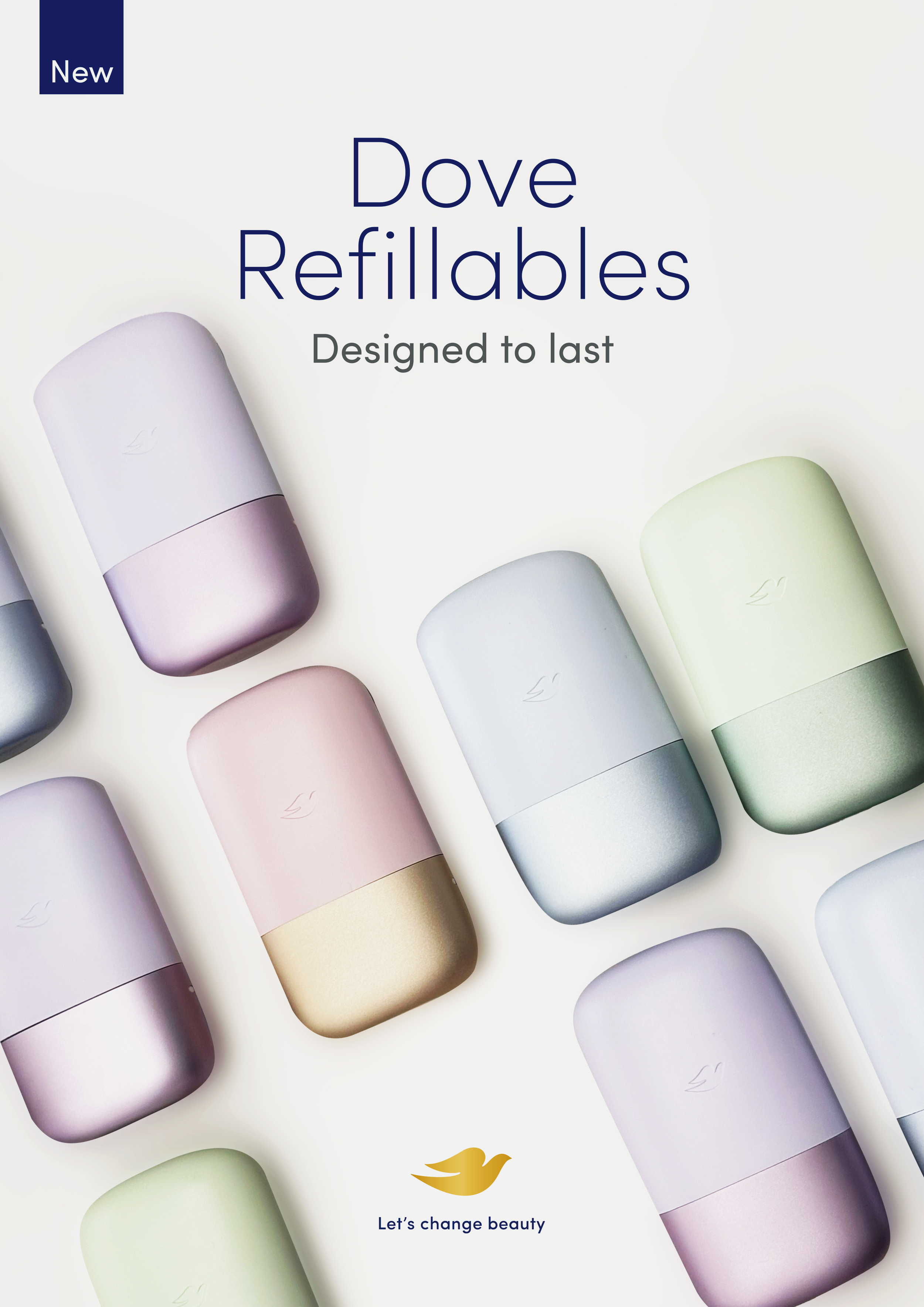
Explorations for
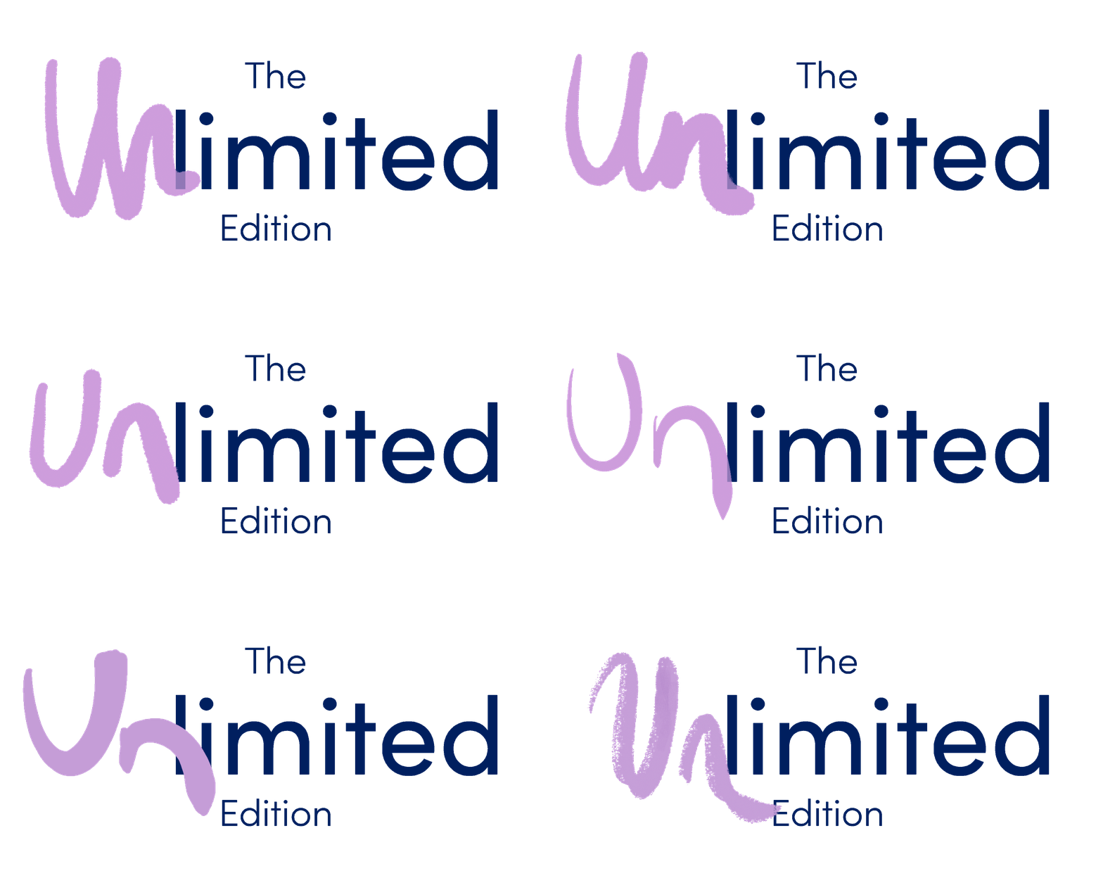
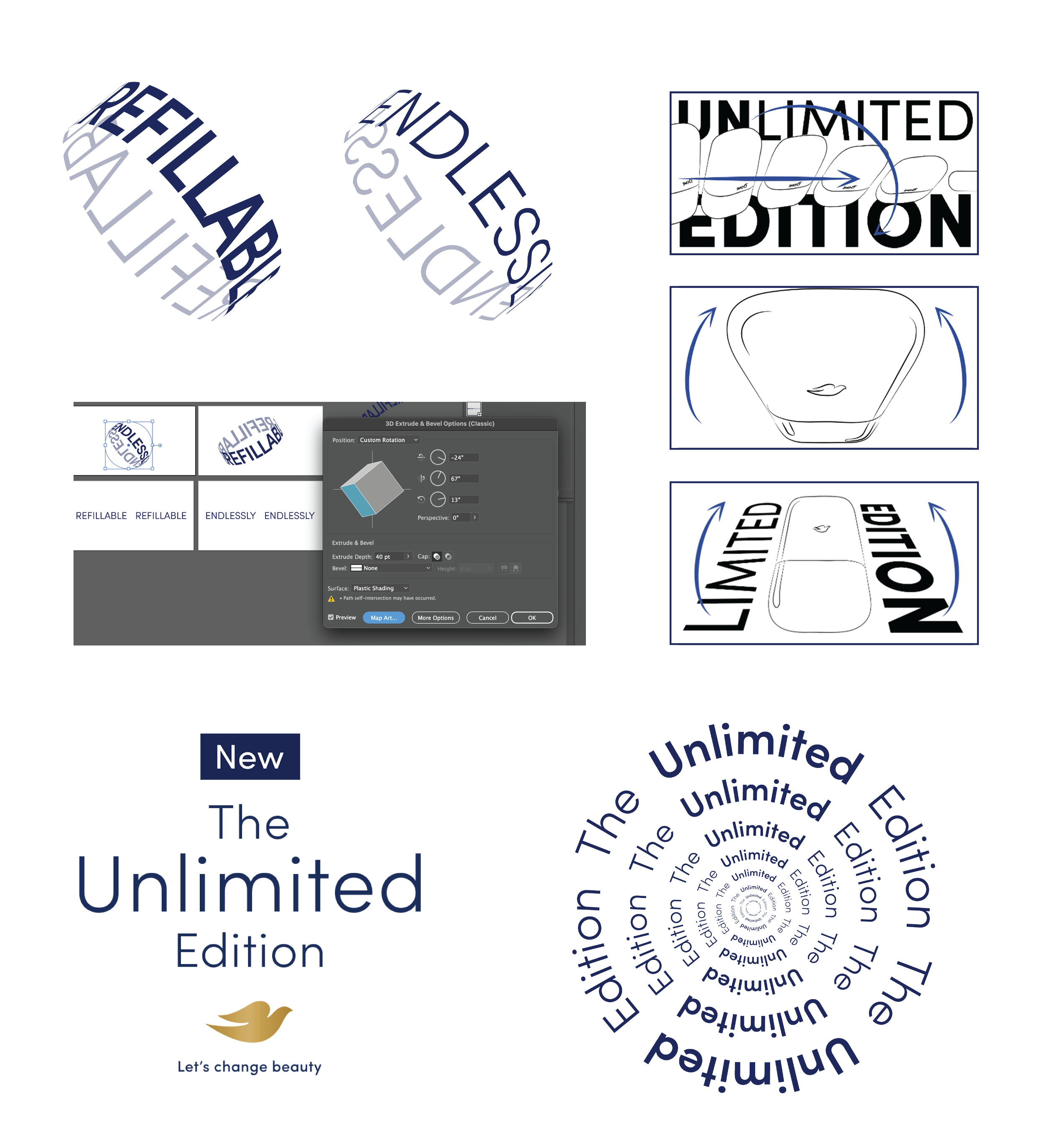
‘unlimited’ designs
Photoshop | AI software | Hand Lettering
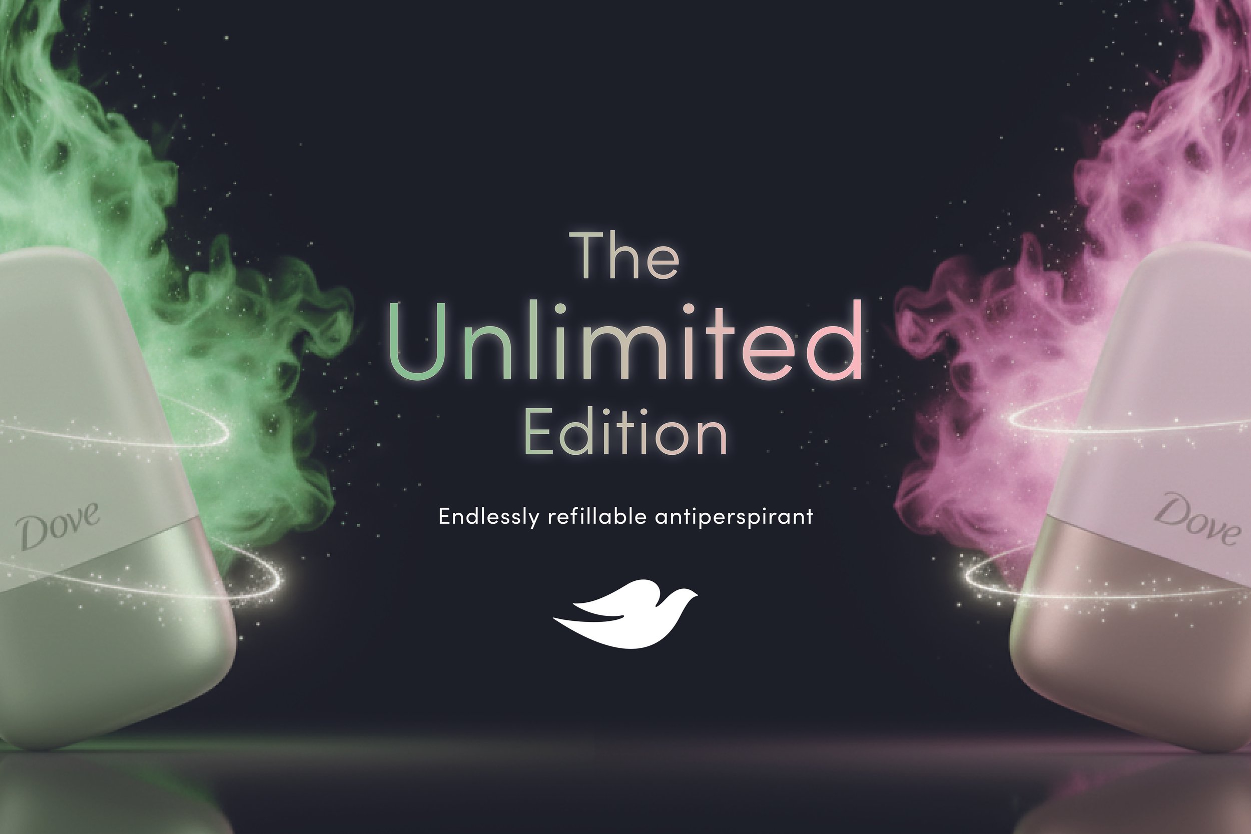
The campaign concept challenged the cultural appeal of limited-edition product drops by positioning Dove Refillable Antiperspirant as the "Unlimited Edition." By subverting the exclusivity associated with collectible launches, the creative celebrated the product's refillable,
long-lasting nature while borrowing the visual language of highly desirable limited releases.
The design result: A system that balanced premium desirability with everyday permanence, creating a bold, recognisable identity that could adapt effortlessly across OOH, POS and wider campaign assets while making the product feel like a must-have – not just for now, but forever.
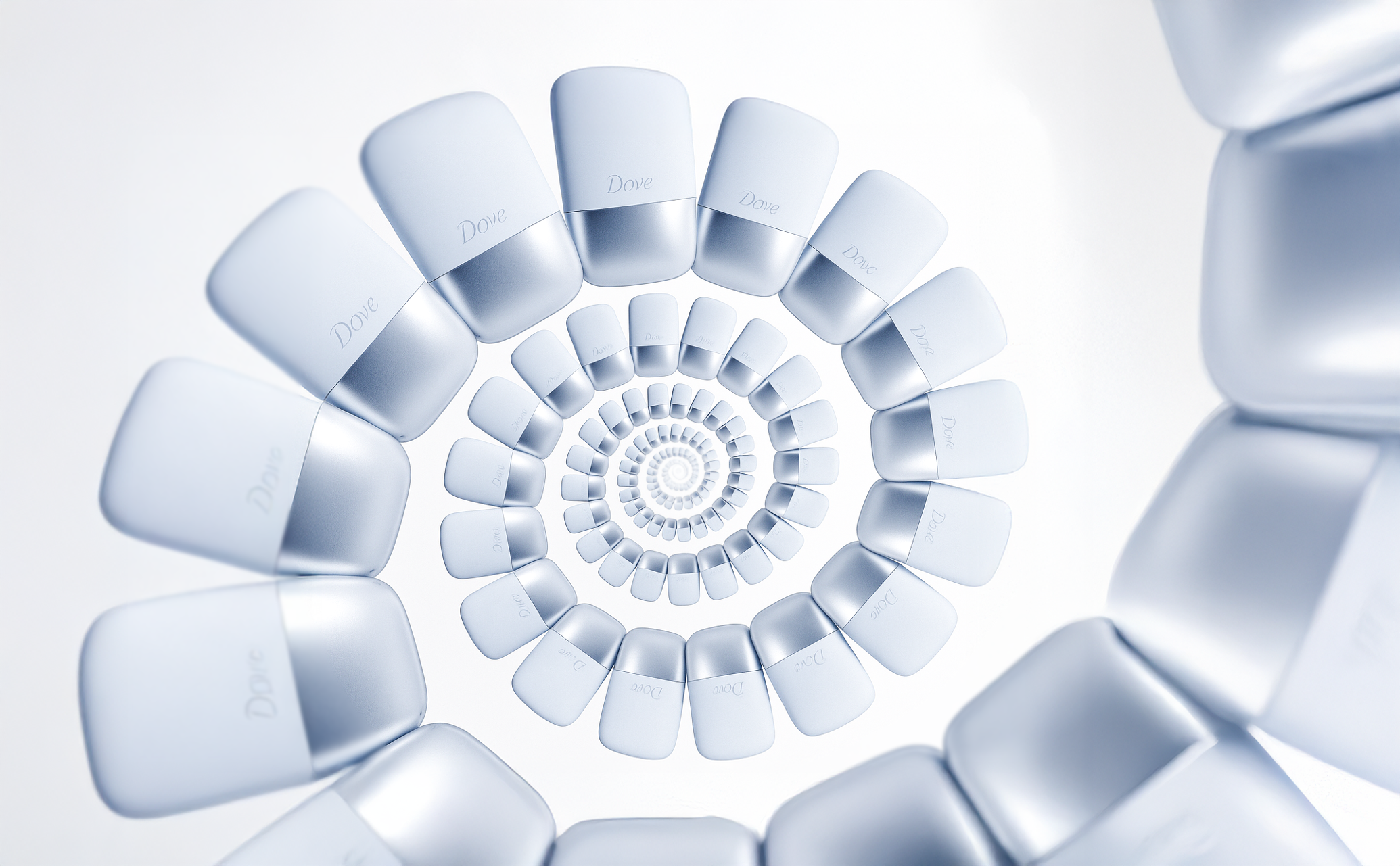
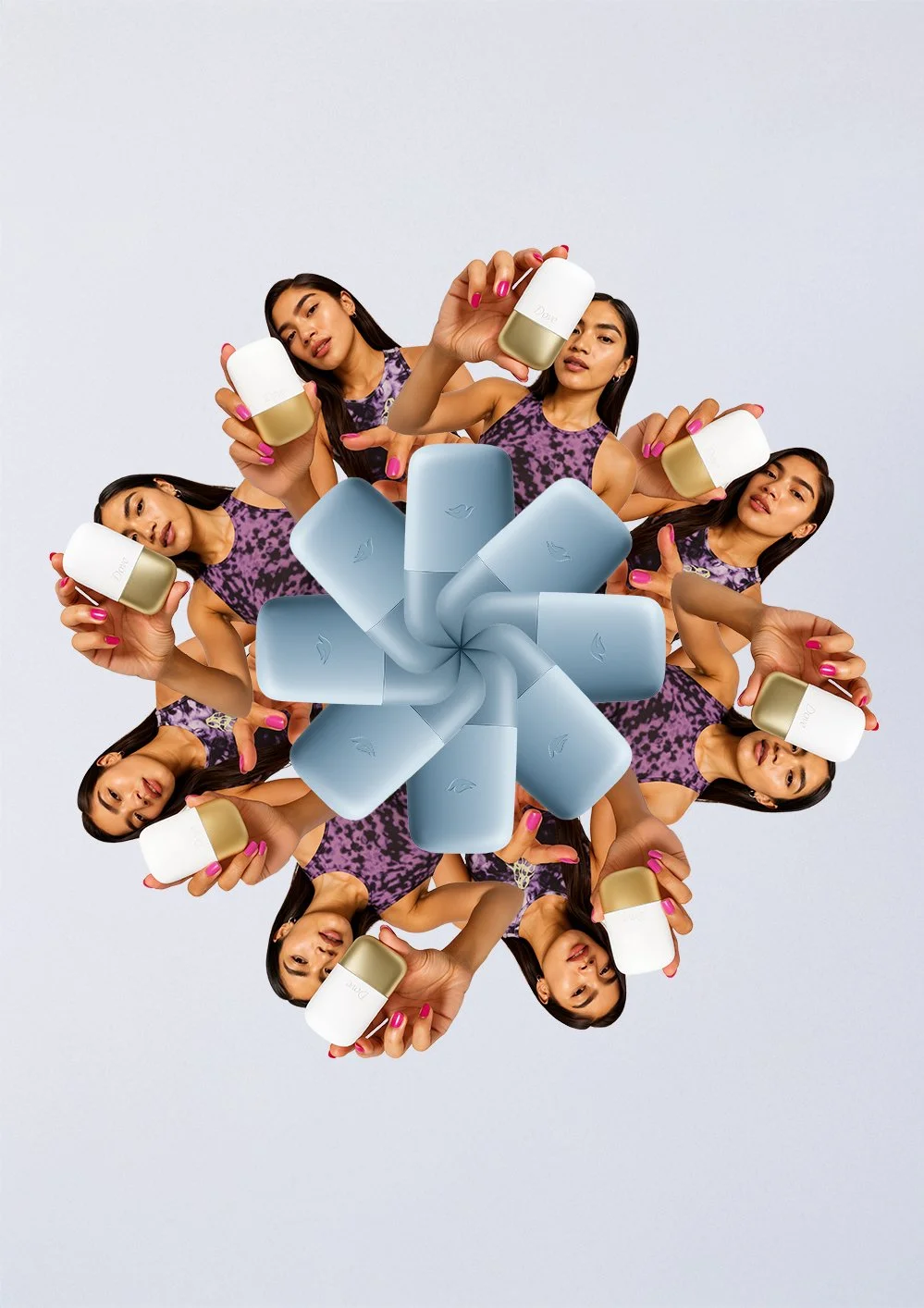
A key part of the design process was exploring visual ways to express the concept of unlimited. This included creating compositions where products repeated endlessly, developing adaptive colour systems that continuously evolved across applications, and experimenting with spirals, kaleidoscopic forms and infinite patterns to evoke repetition, movement and permanence.
These explorations helped shape a flexible visual language that reinforced the campaign narrative while remaining true to Dove.

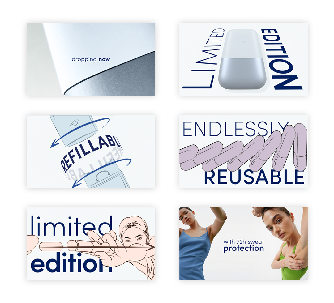
TVC 30” Campaign
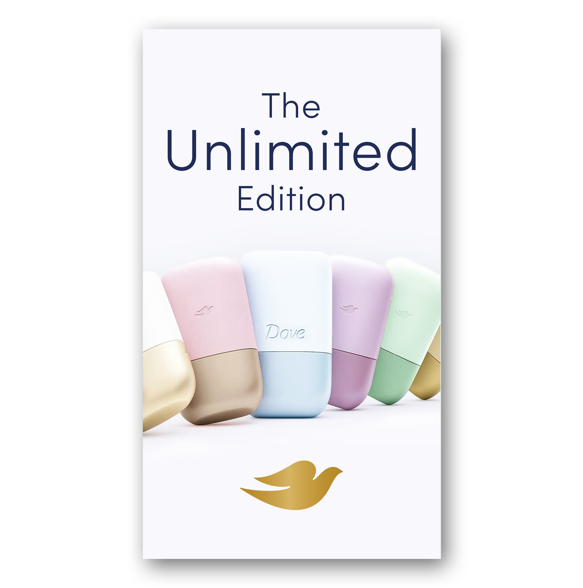
I created the typographic lockups for the TVC/ endframe and storyboards - the production house then added a subtle motion flare
Pro-Active idea
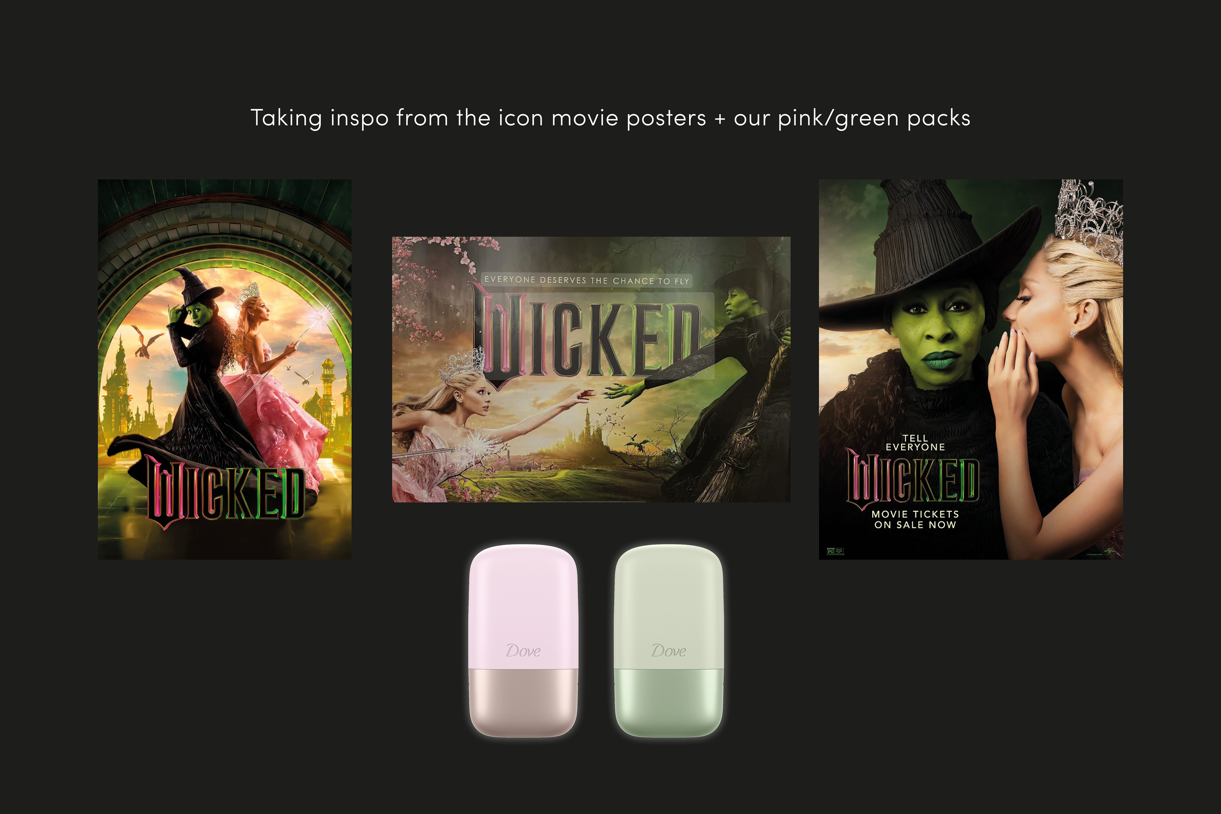
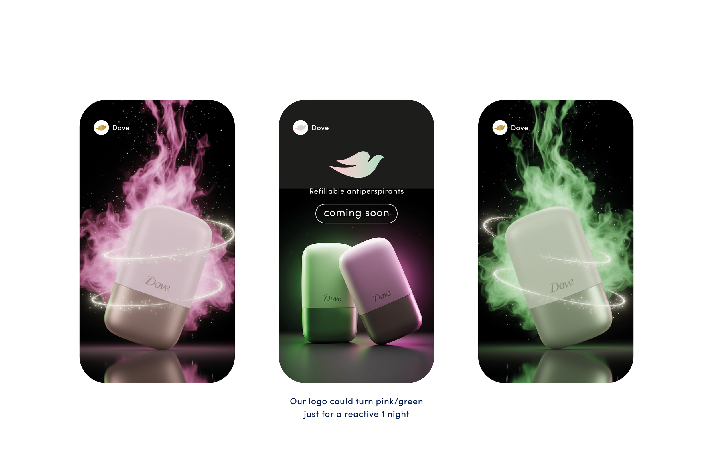
Idea I had for the product launch (side personal project).
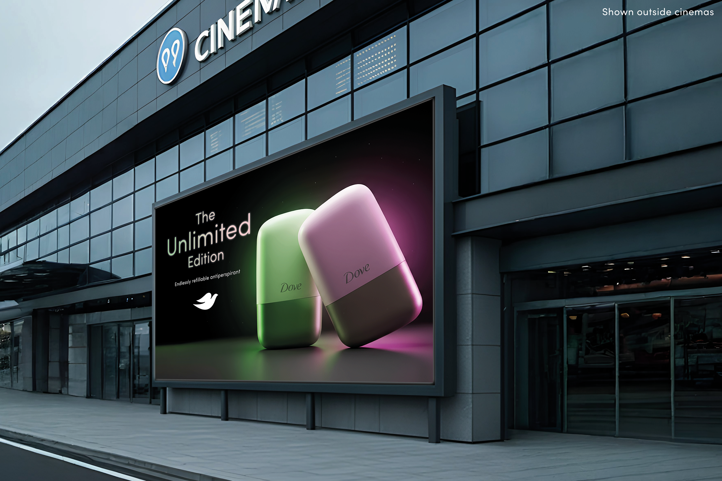
The product range included pink and green packs, and the campaign was called “The Unlimited Edition” which sparked the idea that we could coincided with Wicked being released in cinemas end of that year - create one-off teaser posters that are “limited” prints near cinemas or “limited” social reactive posts.
“Together we're unlimited," from the Wicked musical.
Photoshop | AI